On March 28, we updated the Portal with a number of incremental changes and improvements based on the feedback of our users and observations of how the site was both performing and being used. Many of the changes are cosmetic, but we’ve introduced a couple of requested features worth noting. Here’s what we did and why:
New Featured Images on the Homepage
We put out a few calls on facebook and in email newsletters for everyone to vote on a handful of new header designs. Fifty-four of you spoke, and we followed your lead. The top seven winners will be in rotation for the next few months.
Updates to Filtering
As you probably know we offer filterable searches to enhance the quality of your normal keyword searching. These typically occur as either pre-filtered from the homepage search or an advanced search screen, or from the left-hand sidebar of results pages. We’ve made 2 notable changes here:
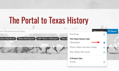 On the homepage, if you always search for the same type of object, newspapers for instance, you can now set it as your default search type from the “Any types” dropdown. Just click the star icon and we’ll set a cookie in your browser to remember your preference.
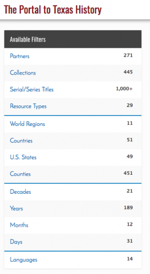 We also realized that it was cumbersome to require people who wanted to filter a query based on a date to always start with a decade range before zeroing in on a specific year. Now you can skip past the decade and specify a year from the get-go, or even skip both, and look for content by month or date (e.g. you only want newspapers from February 1st, regardless of the year). If you have a range of years to search for you can still do this from the advanced search too. You’ll also note that we’ve tweaked the layout and organization of the filters, dividing and grouping items together for easier visual scanning.
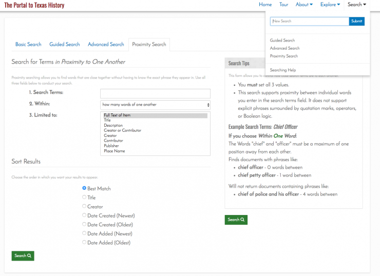
Name Searches
A large number of you search for people. We get that. In our last update we provided a specialized proximity search that would let you really hone your results. Looking for a relative (e.g. Thomas Fountain), would normally be like looking for a needle in a haystack since both words are common, but the new search made it a bit easier to find the words “Thomas” and “Fountain” within a specific number of words of each other. Sure you could search for the phrase “Thomas Fountain” in quotes, but that would miss instances of “Thomas J. Fountain.” Alas, we still see less than a 1% use rate, even though it’s a really powerful tool. Well, this go around we are trying something a bit more proactive. Now whenever your search query contains a popular first name (more in a second), we provide a suggestions in the left-hand column of the results page.
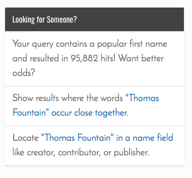
And how do we define “a popular first name” you ask? Well, we grabbed a list of the top 1,000 popular names for every year going back to 1890 from the Social Security Administration and removed all the duplicates. With all the many variant spellings used over the years there are nearly 7,000 names in the list. We recognize that this will get some false hits, like “Fort Davis,” and “Lake Travis”, etc. But we think it’s an interesting experiment nonetheless.
Back to Results
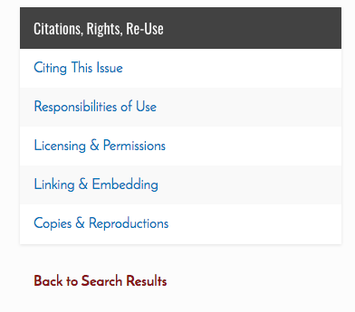
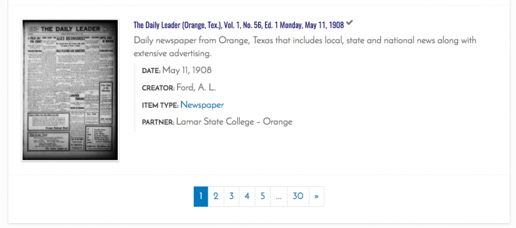
Clicking “Back to Search Results” from an object will now drop you down the results-set page to where you left off. In the original version of the Portal, results were provided in groups of 10 before pagination kicked in. This meant that there wasn’t a lot of scrolling on results pages, but you had to click through a number of pages. Our June 2016 revision upped the number of results per page to 25 to cut down on click-through rates and also included larger thumbnails which made the overall page length much longer. We had several requests from folks who noted that once on a resulting item, that if they clicked the “back to results” links in the breadcrumbs or sidebar, that they were taken back to the top of the page (as they always had been), but because of the 15 additional search results and larger thumbnails, had to re-scroll a significant amount if they were looking at results at the bottom of the page. This is now fixed.
Layout and Template Changes
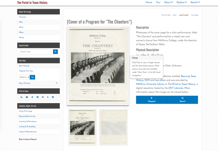
The portal is designed with “responsive” design principles, meaning that it can work using the same code regardless of whether the viewer is on a smartphone or a high-definition widescreen device. It adapts to the width of the device viewing it, showing, hiding, or reflowing page elements in ways that should make sense given the current viewing scenario. The June 2016 revision allowed for an infinitely large screen, and templated pages continued to expand no matter how wide the monitor was. While some people like big images, for others it’s just too much and so we’ve restricted the viewport to a maximum size.
We’ve also changed how we do sidebars and the header. For devices larger than smartphones, the site used to have a sticky sidebar, meaning items appearing in the left-hand column were basically always visible, regardless of if you had scrolled the page or not. We say “basically”, because we also had a button that let you hide the sidebar completely and expand the column with the main content to the full width of the device. But almost no one used that latter function, and we also found that the code rendering the sidebar was just too clunky. Sidebars now simply scroll away as is typical with many sites on the web.
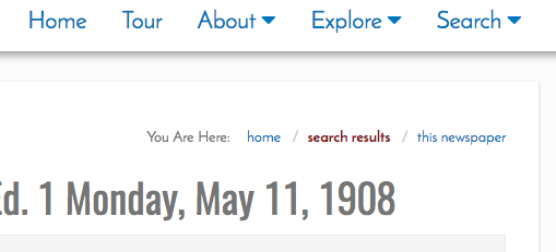
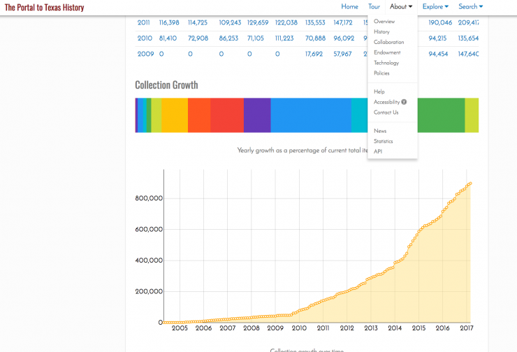
Similarly, we’ve revised the header a bit to be sticky on most pages so that the options there are always available, including a basic search widget, and we’ve simplified the dropdowns that occur when you click into either the about or explore sections of the site.
Zoomable Objects
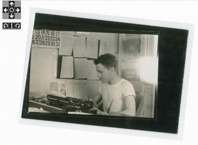
Zoomed images can now be rotated. We’ve included buttons that will shift the image 90 degrees at a time, but if you need subtler adjustments you can hold down the shift key while dragging the image (on a desktop), or two-finger pinch and twist on a mobile device.
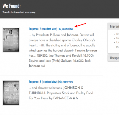
For text-based items that are searchable, the object’s search results page now contains links to either the standard view or the zoomable interface directly.
These are a few of the most prominent changes for this go-around. If you have questions or comments we’d love to hear from you. You can give us direct feedback here.


